David Sunflower Seeds
Brand Refresh & Packaging
When David, the beloved sunflower seed brand, approached us, they were on a mission to elevate their legacy. But this wasn't just your typical branding project; it was a journey to embrace and celebrate the profound connection between the brand and the very essence of America.
Imagine a design that intricately weaved the vibrant tapestry of American culture, both subtly and boldly. Colors and shapes converged in a harmonious dance, resonating with the soul of the nation. Inspiration flowed from the rugged, blue-collar world of agriculture to the timeless allure of baseball. The outcome was a visual story that echoed the heartbeat of the land it proudly represents.
Every design element adhered to a rigorous grid, mirroring the precision and unwavering commitment of hardworking Americans. But it went beyond aesthetics; it embodied trustworthiness and longevity—values deeply embedded in the American spirit.
David's iconic logo received subtle yet impactful updates, while intricate details hid delightful surprises waiting to be discovered. The end result? A design radiating maturity and timeless allure, seamlessly blending into the world of convenience while paying homage to the enduring American legacy.


This transformation wasn't merely about rebranding; it was a profound journey of self-discovery and renewal. It was about honoring David's roots and propelling the brand into a brighter, more promising future.
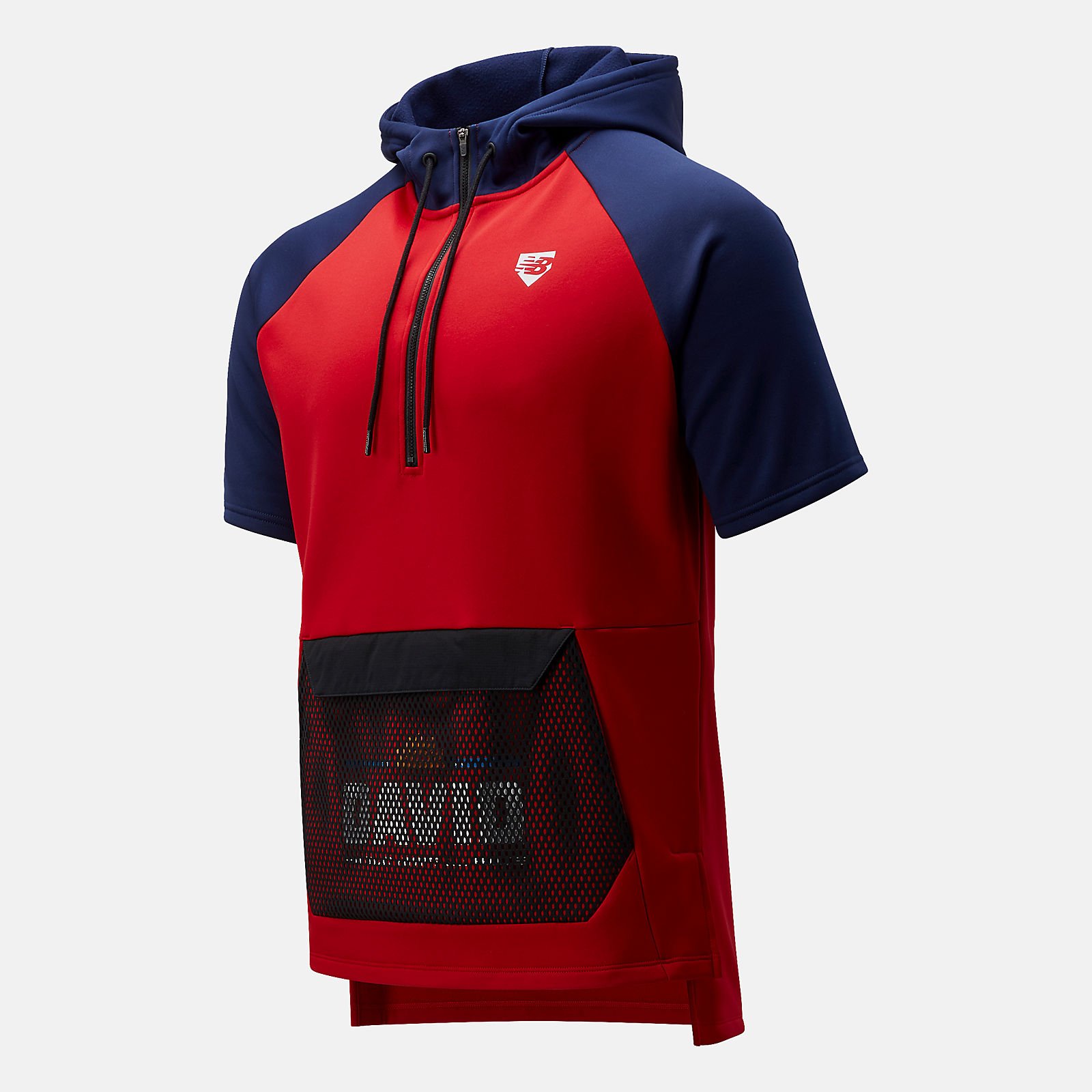
The success of the redesign was so remarkable that it inspired New Balance to create an entire line of athletic wear, infused with the spirit of baseball. While we hadn't initially envisioned our work in this context, it stands as a testament to the fact that we had struck a chord with the hearts and minds of our core audience, leaving an indelible mark on the world of design and beyond.